First impressions are everything! Your logo is the “cover” for your business. Yes, it’s that important!
But the brilliant thing is–your logo doesn’t have to be complex to be really great. In fact, the simpler it is, the more compelling it can be.
And, you don’t have to spend a penny to get a professional-looking logo. We’re going to stick with free online research and tools to create a piano studio logo that stands out and reflects your brand.
I’ve done my best to walk you through this process step by step, so even if you don’t feel creative at all, you can effortlessly design the perfect piano studio logo.
Before Your Design Your Piano Studio Logo
Your piano studio logo will feature the name of your business. It is THE most important part of the logo, in fact!
If you haven’t settled on a name for your piano studio yet, take care of that step first, my friend!
What Makes a Good Piano Studio Logo?

The Best Piano Studio Logos Are Simple
Keep it simple!
A simple logo design will be…
- Easier to reformat for various uses
- Easier to read at a glance
- More memorable
- More recognizable
- Clearer branding
- More timeless and less trendy
The Best Piano Studio Logos Are Eye-Catching
By keeping your piano studio logo simple, you’re halfway there. But also consider a graphic and eye-catching design.
Remember that your logo will often be very small in size. You want users to notice it even in the corner of the screen rather than having it fade into the background.
Here are some ways to make your piano studio logo eye-catching:
- Stick to one pop of color
- Keep shapes or icons simple and graphic
- Use the least amount of words as you can get away with
- Keep your font readable
- Make sure you easily make out the words and graphics of your logo when reduced to a very small size (like 1” x 1”)
The Best Piano Studio Logos Tell Your Brand Story
A great piano studio logo should tell your story.
How does a logo tell a story?
Your word choices.
Your font choices.
Your graphics or icons.
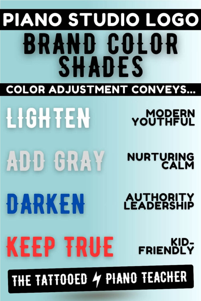
Your colors.
They all tell a story! Make sure your logo matches the vibe of you and your business while still maintaining the previous guidelines (simple and eye-catching).
Research Colors For Your Piano Studio Logo
Is it just me, or do you ever have the urge to start new businesses just so you can pick out new brand colors?!
No, just me? Ok, fair enough.
In any case, we’re getting into the fun part now, my teacher friend!
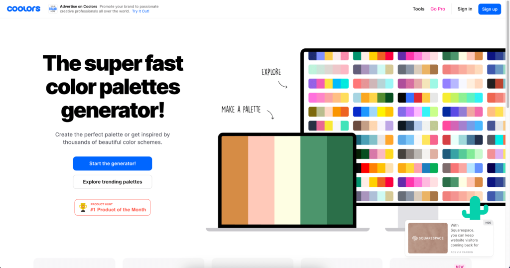
Coolors.co Color Palette Generator
Let’s go to Coolors.co to explore color palettes. Coolors.co is a free online tool you can use to explore and export a color palette.
There are three different ways to explore colors on this site:

- You can start with a color or colors you already know you want to include and explore from there. If you have a color in mind, hit the Start the Generator button on Coolor’s homepage to get started.
- Or you can start with an image that includes colors you like. You could screenshot a logo that appeals to you and Coolors will extract the colors and create a palette from there. To use this feature, click Start the Generator on the homepage and then click the Camera icon to upload the image file you’d like to use.
- You can also just browse suggested color palettes. Let’s use this feature!
Find Trending Color Palettes
- Click Explore Trending Palettes from the Coolors.co homepage.
- Browse the suggested palettes until you find one that speaks to you and your business.
- Click the THREE DOTS under the palette you like.
- Click Open in the generator.
- Play around and adjust any color, add another color, or delete any colors that don’t fit.
- When you’re ready, click Export your palette!
- First, click Share to send it to your email. This way you can quickly access and edit your palette later.
- Next, Export again, but this time choose PDF. This will be a priceless file on your desktop as you design your logo and your website.
- Click Save to create a free account on Coolors.co remembers your color choices.
Browse Logo Templates
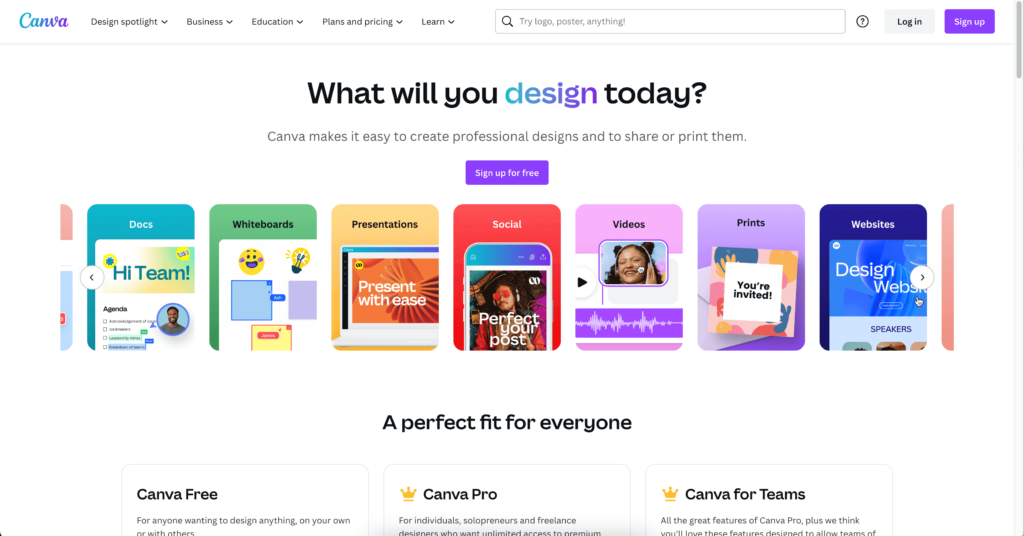
Next, we’re going to Canva.com!
Once you have a free account on Canva, click Create a Design on the homepage. Select Logo from the dropdown menu.
Canva will then show you a multitude of templates on the left to get you started. Although you are welcome to start from scratch, I suggest scrolling through the Templates to find one you like.
Remember that you can customize the colors, icons, and fonts on any Template. So really you’re just looking for a general layout you like to start with.
Also don’t worry so much about whether it’s a light text on a dark background or vice versa. We’ll be creating a “light on dark” version and a “dark on light” version for various uses.
Once you’ve found a Logo Template you like, click on it and let’s customize.
You can always easily start over with a different template or create a couple of versions and choose later. It’s not that big of a commitment at this point. Just pick one and move on!
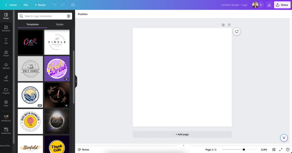
Customize Text With Your Piano Studio Name
Start by changing the template text to your business name.
I like to do this first because if the template doesn’t really work with the amount of words in your piano studio name, you’ll know right away.
Customize Icons For Your Piano Studio Logo
If the template you chose is just text, skip this step.
If there are any icons (little pictures) included in your logo template, go ahead and change them to piano-relevant icons.
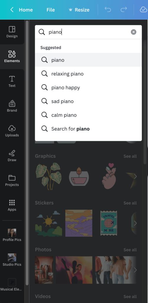
Click Elements on the left-side menu. Type something like “Piano” or “Music” (or whatever you think would convey or match your business name) in the search bar to see relevant suggestions.
Next, click Graphics>See all to see the full list of icon clipart.
Insert the icon you like. Resize and place it where you think it looks good. If you’re not sure how to incorporate it, make it the same size and color as the icon you are replacing and try putting it in the same spot.
Troubleshooting Graphics on Canva
Need to place a graphic BEHIND the text or another element? Easy with Canva!
- Click the graphic in question.
- Click the three dots that appear above it.
- Click Layer.
- Click Send to back or whichever option suits your situation.
How come some graphics have a little crown next to them? Why can’t I use those? Any features, images or elements with a little crown icon are only available for Canva Pro users. Personally, I pay for Canva Pro and love it! But if you want to keep this project totally free, choose a graphic that does not have the crown and you’re good to go.
Colors For Your Piano Studio Logo
Copy HEX codes from your color palette
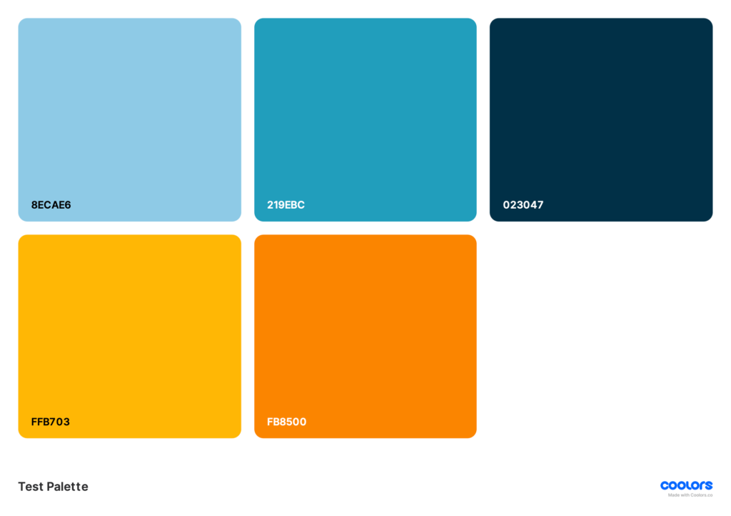
Got that color palette file handy? We’ll use the HEX codes to customize the colors of the logo before we go further with our design.
- Click on the background of your logo. A small square showing that color should appear at the top. Click it. From here you can copy and paste the HEX code of one the colors from your color palette.
- Continue clicking each piece of text and element. Change the color of each to reflect your brand colors.
How many colors should I use in my piano studio logo?
Your piano studio logo should NOT use ALL of the colors in your palette! Here are some options to try:
- Choose one light color from your palette plus black.
- Choose one dark color from your palette plus white.
- Choose one medium color from your palette plus either black or white (experiment to see what looks best and is most readable).
- Choose one light color and one dark color from your palette. (This is what I did for my logo!)
At absolute MOST, do not exceed three colors in your logo.
But I like the other colors I chose and I want to use them! I know! I get excited about color combinations, too! Believe me, we will use all of your colors. There will be plenty of room for multiple colors on your website. Plus, we’re going to make multiple versions of your logo. So, just sit tight.
Rule of Contrast
Make sure the two colors you chose really contrast each other enough to be compelling and readable from a distance or in a tiny size.
Customize Fonts For Your Piano Studio Logo
Save your current version
How do you like your logo so far? If you absolutely love it and don’t want to change a thing, let’s save the current version before we experiment further.
Here’s a little hack: Click the little Duplicate page icon above your logo. This way you can keep the current version for comparison and if you change something and hate it you can go back to this version.
Big Fonts First
Start with the biggest text first. Are there initials or a monogram on your logo? Start there to experiment with different fonts.
Next experiment with the main text of the logo, or any smaller text.
Font = Vibe
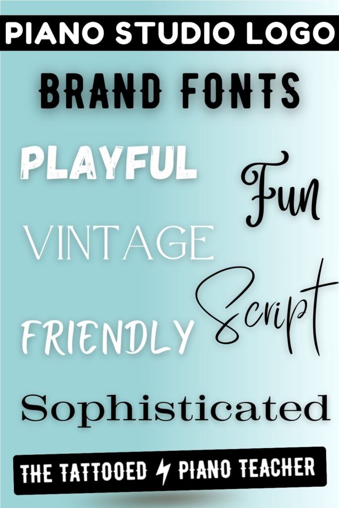
Every font has its own “vibe.”
If you want to send a message that your business caters to kids and you are a super creative and fun teacher, choose a more juvenile, joyful, playful, fun font.
If you’re going for more of a professional look like you cater to an exclusive, serious music student and you offer a high caliber of education, then you might want to go with more of a sophisticated, minimalist font.
Are you an empathetic listener and intuitive teacher? Maybe more of a script font will give off that vibe.
Searching Fonts
Canva has a lot of fonts! You could be here all day scrolling and clicking!
I suggest trying their search feature. You could type in something like “bold” or “cursive” or “funky.” Start with the first word that comes to mind and use Canva’s suggested categories to navigate to a much shorter list of fonts to choose from.
Don’t Go Font Crazy!
I know! There are so many fun fonts to choose from and you want to incorporate all of your favorites. Been there.
But like colors, there will be a time and a place to use more fonts.
For now, stick with ONE FONT for your entire logo. Or choose TWO FONTS such as a bold initial plus a script full business name. If you choose to go with two fonts, make sure they compliment each other and tell the same story (but they can be from different font categories).
Customize Design Elements For Your Piano Studio Logo
Chances are your piano studio logo is already complete!
But if you happen to have any other untouched elements (such as a line, arrow, box, or the like), now is the time to consider replacing them, editing them, or deleting them.
Duplicate Your Piano Studio Logo In Different Formats
Congratulations, pianopreneur! You have yourself a piano studio logo!
If you are not totally loving it, I suggest saving and starting the process over with a new template. But assuming you like what you’ve got so far, let’s create some variations so you’ll have all the files you need for your website, social media, printed materials, and beyond.
Creating Square Logo Variations
Here’s a list of variations I suggest creating in the same square format:
- An entirely white version with a black background
- An entirely black version with a white background
- A version in your lightest brand color with a dark or black background
- A version in your medium brand color with a white background
- A version in your darkest brand color with a light or white background
And if you do have (or purchase) Canva Pro, I suggest also creating these square logos:
- An entirely white version with a transparent background*
- An entirely black version with a transparent background*
- A version in your lightest brand color with a transparent background*
- A version in your medium brand color with a transparent background*
- A version in your darkest brand color with a transparent background*
*We’ll go over how to save with a transparent background in a moment.
Creating Different Logo Shapes
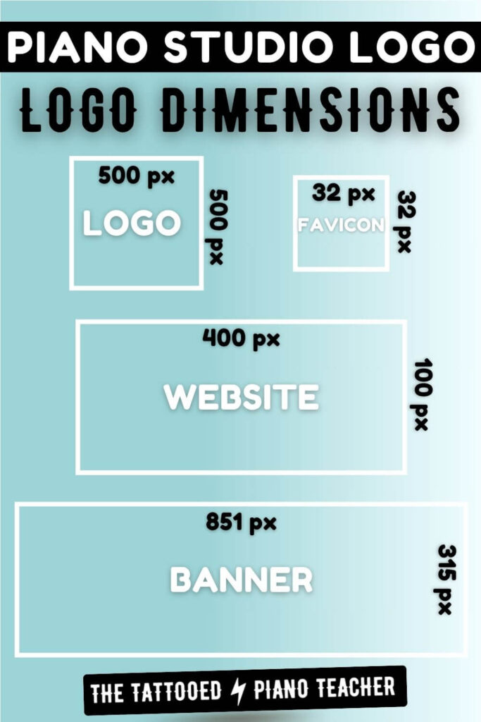
If you have Canva Pro, you can resize your logo with one click. If you just have a free account, fear not! I have a work-around.
First, we’ll create a general-use horizontal size logo: 400 x 100 pixels.
- With your current logo project tab still open, return to the Canva homepage tab.
- Click “Create a Design.”
- Select “Custom Size.”
- Enter a Width of “400” and a Length of “100.”
- Click “Create New Design” to open a new tab.
- Return to your square logo project tab and copy each individual element on the main logo by right-clicking on it and selecting “Copy.”
- Now go over to your new project tab, right-click on the blank logo, and select “Paste.”
- Repeat these steps until all of your elements are copied over.
- Now just resize and move the elements around to create a rectangular version of your logo!
Now repeat those steps to create a Facebook cover-sized logo: 851 x 315 pixels.
If you have inspiration to try other shapes, sizes, or variations, now is the time! Go crazy and get creative.
But don’t stress about this step too much. The beautiful thing about Canva is–you now have a saved project you can come back to at any time.
Save Your Piano Studio Logo
When you’re satisfied with your designs [and, if you’re like me, you have one million tabs open], it’s time to officially save (download) your logos. And this is very easy to do!
- Click “Share” in the upper right corner.
- Click “Download.”
- Select “PNG.”
- If you have Canva Pro, select “Transparent Background” for any applicable designs.
- Name your file and select where you want to store your logos.
Whoohoo! You are officially logo-ified!
Turn Your Piano Studio Logo Into a Favicon
What is a favicon?
Look up at the top of your browser at all open tabs. See the little lightning bolt on this tab? And the little “C” on the Canva tab?
Those are favicons!
Favicons are simply tiny images assigned to a website that appear on the browser tabs.
If you don’t have a favicon assigned to your website, it will default to something like the WordPress logo–and we don’t want that!
Create your favicon
Thankfully, favicons are even simpler than logos and you’re going to create yours right now in no time at all!
If you have Canva Pro, resize your square logo project to these dimensions: 32 x 32 pixels.
And if you have a free Canva account, start a new design from the homepage with the custom dimensions: 32 x 32 pixels.
Pick one simple element
Now pick one simple element to represent your brand on a tab.
You could pick:
- A one-letter initial in your brand font and color
- An icon, if one appears in your logo already
- A design element, such as a star, circle, or embellishment, if it’s simple enough
- Or you can find a music-related icon by searching through Canva’s Elements
Change the background color to match your brand colors, and voila! A favicon
Save your piano studio favicon
- Click “Share.”
- Click “Download.”
- Save it as a JPG this time (a smaller file).
- Name it “Favicon” so we can find it when we are building your website.
Different shaped favicons?
You may be wondering: I see that some favicons, such as Google’s, are different shapes besides squares. Can I do that?
Yes, you can! It’s just a bit tricky to do with a free Canva account.
Want to dive deeper? Leave me a comment and I can create a tutorial. For now, we’ll stick with a square favicon and you can always update it later.
What’s Next?
Armed with your wonderful logo and all of its creative variations, it’s time to build your website!
This is a BIG one. Not only is it a vital step towards starting a successful business, but it can also be quite intimidating. Especially for those of us who lack nerdy coding skills.
But have no fear! I’m here to walk you through and make it as painless as possible.
Just think of how satisfying it will be to see YOUR LOGO up on the interwebs! Hopefully that motivates you to press on and complete your next task. Great job! Keep it up!


3 Responses